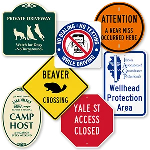
Stop signs are red. Caution signs are yellow. Construction signs are orange. These colors, and what they represent on the road, have been embedded into our daily routines since infancy. In seeing these colors so often, it’s natural to overlook the distinct methodology that determines why road signs and traffic lights are the colors they are, and what factors influence the decisions to add certain colors to certain shapes to maintain road safety.
Generally, colors are classified into three groups: warm colors (red, orange, yellow), cool colors (blue, green, purple), and neutral colors (black, white, brown). Warm colors are typically utilized in graphic design to generate a strong emotion. Thus, a large majority of advisory signs on the roads follow these guidelines.
MODERN DAY SIGNAGE: Color and Meanings
Red
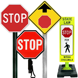
If a sign is directly commanding you to do (or not to do) something, odds are it is red. For example, “Stop,” “Yield,” and “Do Not Enter” signs are all red, with the most crucial information on the road communicated through the use of either entirely red signs or white signs with red text.
Orange and Yellow
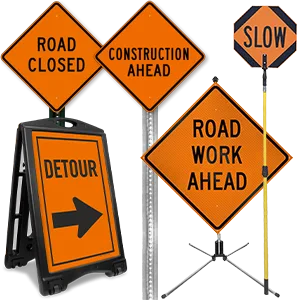
Similarly, warm colors are used to inform motorists of temporary and permanent hazards. Temporary cautions, typically due to construction, have always employed the color orange with black text, while permanent cautions use back text on a yellow backing for maximum readability and visibility. In the past, the most important messages were placed on yellow signs due to their maximal visibility throughout the day and night. The Manual on Uniform Traffic Control Devices (MUTCD) reports that orange signage was not employed until 1964, in response to a larger prevalence of highway construction combined with the release of reflective aluminum materials for increased visibility. Orange continues to be the standard color for construction zones to this day.
Yellow signs like this one indicate a permanent hazard, such as pedestrian-heavy areas (via
RoadTrafficSigns.com).
Orange signs, such as this Road Work sign, indicate more ephemeral hazards. (via
RoadTrafficSigns.com).
Green, Blue and Brown
Less crucial information (that is, information that does not immediately influence the motorist’s action) is generally placed on neutral or cool colored signs. This coloring is intentionally employed as to not command the driver’s attention. The universally recognizable green color on highway exit and directional signs designates information that is purely contingent upon the driver’s intention. Blue signage indicates rest stops and restaurants, and brown designates a location for outdoor recreation. These colors are naturally non-distractive earth tones, intended not to disturb or advise but rather to inform.
Red and green signs, such as rest area and exit markers, feature cooler colors as not to distract the driver.
Black and White
The primary focus of a black and white sign is clarity. The majority of black and white signs are advisory, giving motorists information that impacts their speed and indicates upcoming potential hazards. Many advisory signs simply feature black text on a white background, meaning to plainly and visibly inform drivers without distraction. Speed limit signs, movement regulations, one way signs, and railroad crossing signs are all exclusively black and white, devoid of color to promote an informatory aesthetic.
Black and white signs, such as these keep right, speed limit, and railroad signs are devoid of color to designate a more informatory aesthetic.(via RoadTrafficSigns.com).
Sign Color of the Past: History and Modifications
Yellow stop sign and red stop sign.
While seemingly second-nature, sign color has never been stagnant: the evolution of road signage in the United States has included a large series of updates and modifications. For example, stop signs were not always red. A large array of colors was used on stop signs throughout the country, following its first implementation in Detroit, Michigan in 1915. By the late 1920s, the color was standardized as yellow – remember this was before reflective aluminum was employed on traffic signs, making red a particularly poor choice for nighttime hours.
These 1950’s Micro-Flex Co. Inc. signs advertise yellow stop signs with reflective aluminum beading along the letters of the sign, and the later, reflective aluminum red stop sign that is employed today.
The stop sign was certainly not the only traffic sign to convert from yellow to red following the appropriation of reflective aluminum on road signage. Before the 1960s, yield signs were also yellow. While retaining its triangular outline, the original yield sign utilized yellow in order to maximize visibility. Today, the yield sign, with its characteristic shape, heavy red border, and red text isimmediately communicable and universal.
With the appropriation of reflective aluminum, the yield sign went from yellow to red.
No parking signs also made the conversion from yellow to red, but also changed their shape from circular to rectangular. This modification stems from the movement towards rectangular signs to reduce wasted materials – the only notable exceptions being, of course, yield and stop signs.
No parking signs evolved from yellow to red, changing shape from circular to rectangular to save materials.
Below is an excerpt from the 1935 Manual on Uniform Traffic Control Devices (MUTCD), listing the standardized specifications of traffic signs in the United States. During this era, orange was not incorporated in traffic sign vernacular simply due to the fact that most roadwork at the time involved constructing new roads, not maintaining old ones.
|
|
Color |
| Type |
Shape |
Background |
Message |
| Regulatory |
| Stop |
Octagon |
Yellow |
Black or red |
| Speed |
Vertical |
White |
Black |
| Movement |
| Turning |
Vertical |
White |
Black |
| Signals |
Vertical |
White |
Black |
| One way |
Arrow |
White |
Black |
| Alignment |
Vertical |
White |
Black |
| Exclusion |
Vertical |
White |
Black |
| Parking |
| Prohibition |
Vertical |
White |
Red |
| Restriction |
Vertical |
White |
Green |
| Miscellaneous |
Vertical |
White |
Black |
| Warning |
| Slow |
Diamond |
Yellow |
Black |
| Caution |
Square |
Yellow |
Black |
| Railroad advance |
Circle |
Yellow |
Black |
| Railroad crossing |
Cross-buck |
White |
Black |
| Guide |
| Route Marker |
| U.S. |
Shield |
White |
Black |
| State |
Special |
White |
Black |
| Auxiliary signs |
Horizontal |
White |
Black |
| Destination |
Horizontal |
White |
Black |
| Location |
Horizontal |
White |
Black |
| Information |
Horizontal |
White |
Black |
| Rest station |
Clover leaf |
Green |
White |
Traffic Light Evolution
The color of traffic lights also has a vibrant and significant history. The red and green colors for stop and go, respectively, were derived from early train signals. In the 19th century, trains utilized gas lamps that illuminated red and green to indicate whether trains should maintain speed or come to a stop. A series of modifications to this technique were used on the road. One such change was brought about at the beginning of the 20th century, with a buzzer employed to indicate when the light would change from green to red and vice versa. In New York City, the yellow light emerged to designate the movement of north- and south-bound traffic, while the green light meant that east and west bound traffic moves. This system was not well-received and caused a great deal of confusion, which led to the emergence of the standardized traffic light: green for go, red for stop, and yellow for slow down.

The traffic light in its current form
features the familiar red and green lights
(sign via
RoadTrafficSigns.com).
The red light is placed on top of each stop light to allow for increased visibility of an eventual stop – if the automobile is cresting a hill, it will know to stop sooner and will more effectively reduce hazard. One primarily Irish-populated town in upstate New York, Tipperary Hill, objected to the placement of “British” red over “Irish” green, and local Irish immigrant youths would throw stones at the town’s red light atop its first traffic signal. This became such a prevalent issue that the town released a “green-over-red” traffic light in place of the traditional, standardized version, which still remains in operation today.

Tipperary Hill’s Irish residents
maintain their pride with the town’s
green-over-red traffic light.
Despite this minor protestation, the current traffic light system was universalized on April 27, 1925 and has remained free of criticism for nearly a century. Interestingly enough, the colors in traffic lights are congruent with the methodologies employed in traffic signage: red communicates immediate action, yellow indicates caution, and green suggests uninterrupted travel. This overlap has become imbedded in traffic sign methodologies, with warm, cool, and neutral colors organically employed to most efficiently keep motorists informed and hazard-free.
The usage of color in traffic signs is an ever-evolving entity. With the development of new materials and the improvements in visibility and durability therein, it is not unlikely that a re-systemization of color coding in traffic signs could occur in the future.