The quiet evolution of the one way sign
One way streets are valuable assets in any city – pedestrians need to know where the cars are coming from, and if everyone obeys the rules, there are fewer accidents. The overall history and evolution of signs is a fascinating subject (we think), and there is no sign more taken for granted than the one way sign. Here, we’re going to discuss how, in the past seven decades, the design of the one way sign has undergone a slow and steady metamorphosis.
1940
Early one-way arrows were slightly more complicated than the signs we see today, and less standardized, with creative flair showing through.
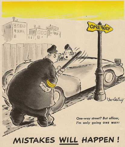
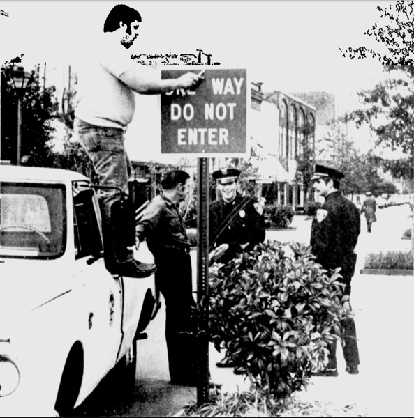
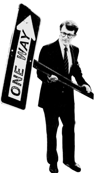
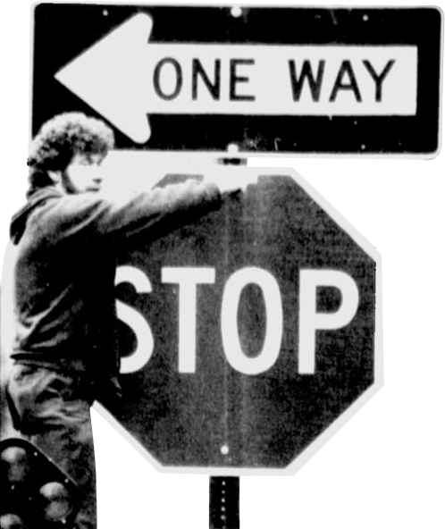
A comic reaction to the one-way sign
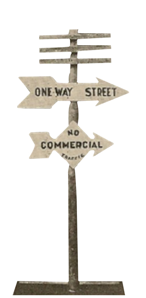
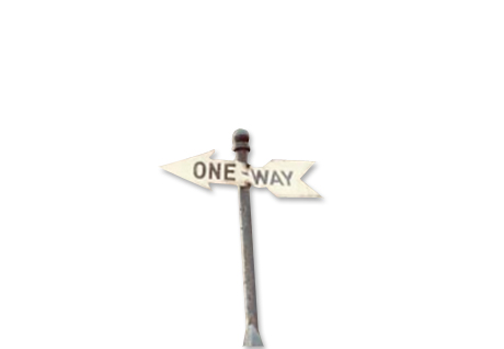
This one-way sign uses a classic “cross-foot” arrow design.
1950
The signs of the ’50s differ significantly from the older versions and are quite similar to modern day designs.
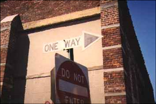
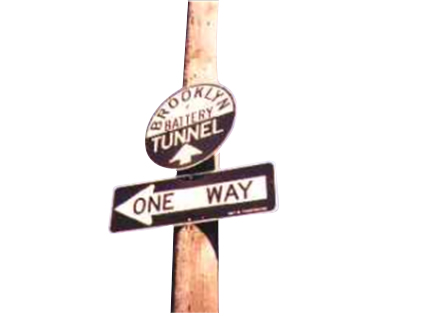
A simpler adaptation of the arrow shaped one-way sign with straight angles. It is clubbed with the traditional MUTCD Do Not Enter Signage. Image taken at Brooklyn in the 1950s. These signs are believed to have lasted at least till the 60’s.
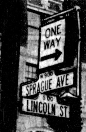
One Way Street Signs posted in 1955 when Sprague and First Avenues between Bernard and Walnut became a one-way street. Pedestrian push-buttons were installed as well
1960
The DOT began to alter the colors on the sign, trying to determine what color combination was the easiest to spot. The two signs you see below were two ideas to make the one-way sign more visible.
Developed by DOT in the late 1960’s, this one-way sign was reversed from the typical Black on White background. This change was made because black, as it turns out, was easier to spot instead of plain white sign. This design is used in signs today.
Developed by DOT in the late 1960’s, this one-way sign was reversed from the typical Black on White wording. The design apparently didn’t catch on, since its competitor is the one we still use today.
1970
This decade saw even more variations of the one-way sign than the last; some signs didn’t even have an arrow.
A new one-way sign being installed at the intersection of Main and Liberty Streets in Sumter, South Carolina (1977).
Bearing a striking resemblance with one-way signs from the 1950’s, this is a 1978 one way street sign at Governor Slip and South Street, NY – marred over a period of time.
1980
In the 1980s, most one-way signs looked like they do today, with little variation in different cities or towns. Most know to look for and recognize if a street goes one way, minimizing mistakes and casualties.
1982 – A mayor taking off a one-way-sign in South Carolina to make way for a two-way street.
1987 – Worker installing a grand one-way-sign at Park and Prime Streets in Lewiston, hard to miss!
1990
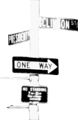
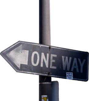
One-way sign design adopted since the 60’s. (Taken in 1992 at a Brooklyn intersection).
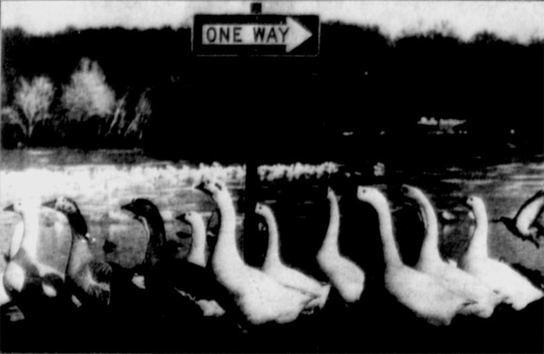
1992 – One -ay sign at Lakeland, Florida.
2000
The twenty-first century saw a new generation of one-way signs. These are high-definition and are of revolutionary material quality. They’re also reflective for maximum visibility in all light conditions and MUTCD compliant (R6-1 or R6-2). As per the standard, “they shall be used to indicate streets or roadways upon which vehicular traffic is allowed to travel in one direction only.”
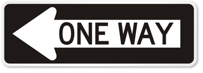
Sign can be seen here.
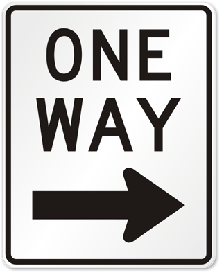
Sign can be seen here.
The design and structure of the sign hasn’t undergone a massive change, but the new 21st century signs built from hi-tech technology are durable to last at least a decade. Unlike the flimsy, rusty signs of past, they are wear-free, tough, and rust-proof, keeping our streets efficient and safe.
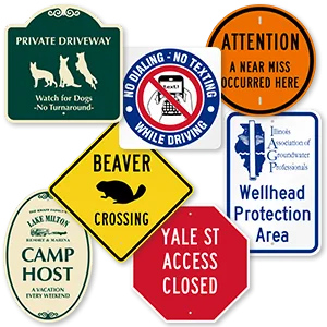
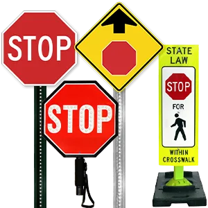
Like this topic? Check out our related products:
-


One Way Signs
-

Designer One Way Signs
-

Custom One Way Signs
Category: Resources, Road safety
